The US continues to stand out as the one major Covid-19 hotspot that can’t definitively claim to be well on the way to winning the fight against the first wave of the virus.
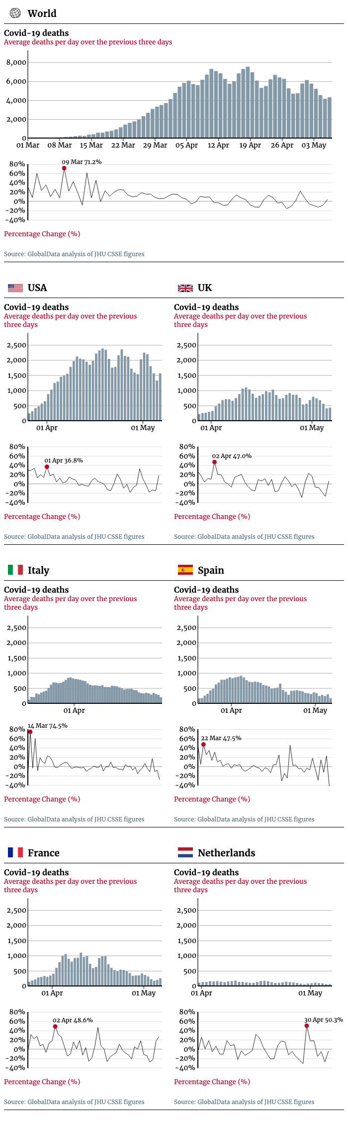
Our chart plots confirmed deaths from Covid-19 as a three-day rolling average to help smooth out quirks in the daily totals.
The US totals have been falling on a week-on-week basis but remain stubbornly high.
By contrast, Italy, Spain and France are seeing deaths at well under a third of “peak” rates, with Italy in particular showing consistent percentage drops.
The global chart remains largely a product of the charts of the US, UK, France, Italy and Spain – who together have been responsible for nearly three-quarters of deaths worldwide.
Covid-19 daily death totals: Are we ‘flattening the curve’?
While every nation is giving regular updates on deaths linked to the virus, it can be difficult to interpret this data.
Daily death totals are volatile and can fluctuate rapidly from day to day; countries can change the time they report, or their methodology, leading to sudden and abrupt change.
Each day is plotted against the average number of new deaths reported over the previous three days. The percentage increases (or decreases) are plotted separately.
The charts cover the countries with the highest number of deaths overall, excluding China – where daily confirm deaths have slowed to a trickle – and Iran, where the data may not be reliable.
The charts start at the point each country passed 1,000 Covid-19 deaths in total.